Posts

Showing posts with the label bad

BA seat changing has poor user interface
Image
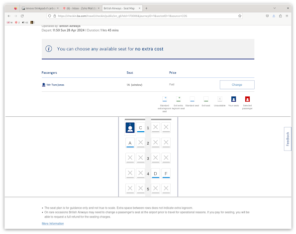
When you check in online with BA, you can accept your seat allocation and click next, or choose to change your seats.  If you choose to change your seats, you are taken to a diagram of the cabin, indicating your seat, available seats, and unavailable seats.  So far so good. Remember, on the step before, you already said you wanted to change your seat. Now, I am not a UX expert, but my naive expectation here was that clicking on the seat might select that seat.  Nothing.  Try again, several times, on different seats.  Nothing.  I've been here before.  What was it?  Eventually, I figure out that I have to click on the "Change" button under "Passengers".  Then I can click on the seat. How many people go through this every day?  All it would take is one manager at BA to actually use the service, and notice, and go "no, we're going to do that properly". The way it seems to have come about is that the interface is designed for a more general c...

Bitstamp still insulting logged-in customers with captchas

Image
It looked like Bitstamp may have left their ill-advised captcha anti-feature behind, but I just got double captcha'd WHEN I WAS ALREADY LOGGED IN. I can not overstate how ill-advised this is.  You are failing at authentication, you are disrespecting your customer by valuing their time at zero.  You are presuming to tell them that they must provide, for free, some of the lowest-value labor in the world, that of training AIs.  In this case, food with motor vehicles, and the question is "what does not belong here".  This is not the future of anything.  If you are doing this, you are doing it very, very, very wrong.

kraken pro login looks bad

Image
Who the fuck came up with this: It's barely visible, but that's a login form, translucent, where you are expected to log in.  The background is a live, changing, and therefore distracting, display of something to do with a market. I haven't tried Kraken "Pro" yet, but based on this, it is going to be some imbecile's imaginings of what a trading thing looks like, rather than anything useful. What real traders want is simple reliable web sites, clear and simple forms for entering orders, good reporting, both for bookkeeping and compliance. It's the KISR princple: "keep it simple, retard".

Edinburgh fringe barely able to sell tickets

Image
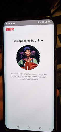
Edfringe has has bad IT, for as long as it's had IT. Now, all tickets are done as QR codes. Good choice. Except the app requires a working internet connection, to display the ticket for the next show. It obvious to anyone but an IT specialist that the app should cache tickets including QR codes. Since showing your ticket at the door is an important and time-critical, um, user journey, nice app design might even ask the question of how to have this QR + basic details for next show as to-hand as possible.  It could be always displayed when in the app, or displayed on the app's main screen and most of its other screens. Could you even get a qr into a badge on the phone's home screen? If not, then a home screen widget would be possible. How many squares? Maybe 4. Instead of which, we have "you need an internet connection" at the door, or no ticket, no qr, no show. As time went on, we realised more and more was being loaded over the internet. There would be big white e...