BA seat changing has poor user interface
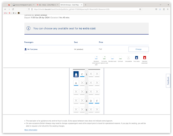
When you check in online with BA, you can accept your seat allocation and click next, or choose to change your seats. If you choose to change your seats, you are taken to a diagram of the cabin, indicating your seat, available seats, and unavailable seats. So far so good.
Remember, on the step before, you already said you wanted to change your seat.Now, I am not a UX expert, but my naive expectation here was that clicking on the seat might select that seat. Nothing. Try again, several times, on different seats. Nothing. I've been here before. What was it? Eventually, I figure out that I have to click on the "Change" button under "Passengers". Then I can click on the seat.
How many people go through this every day? All it would take is one manager at BA to actually use the service, and notice, and go "no, we're going to do that properly".
The way it seems to have come about is that the interface is designed for a more general case, of multiple passengers. You can change the seat for one at a time. Fine. When it's one passenger, pre-select that passenger.


Comments
Post a Comment